One of the most common questions we get from integrators and project managers:
“What brightness do I actually need?”
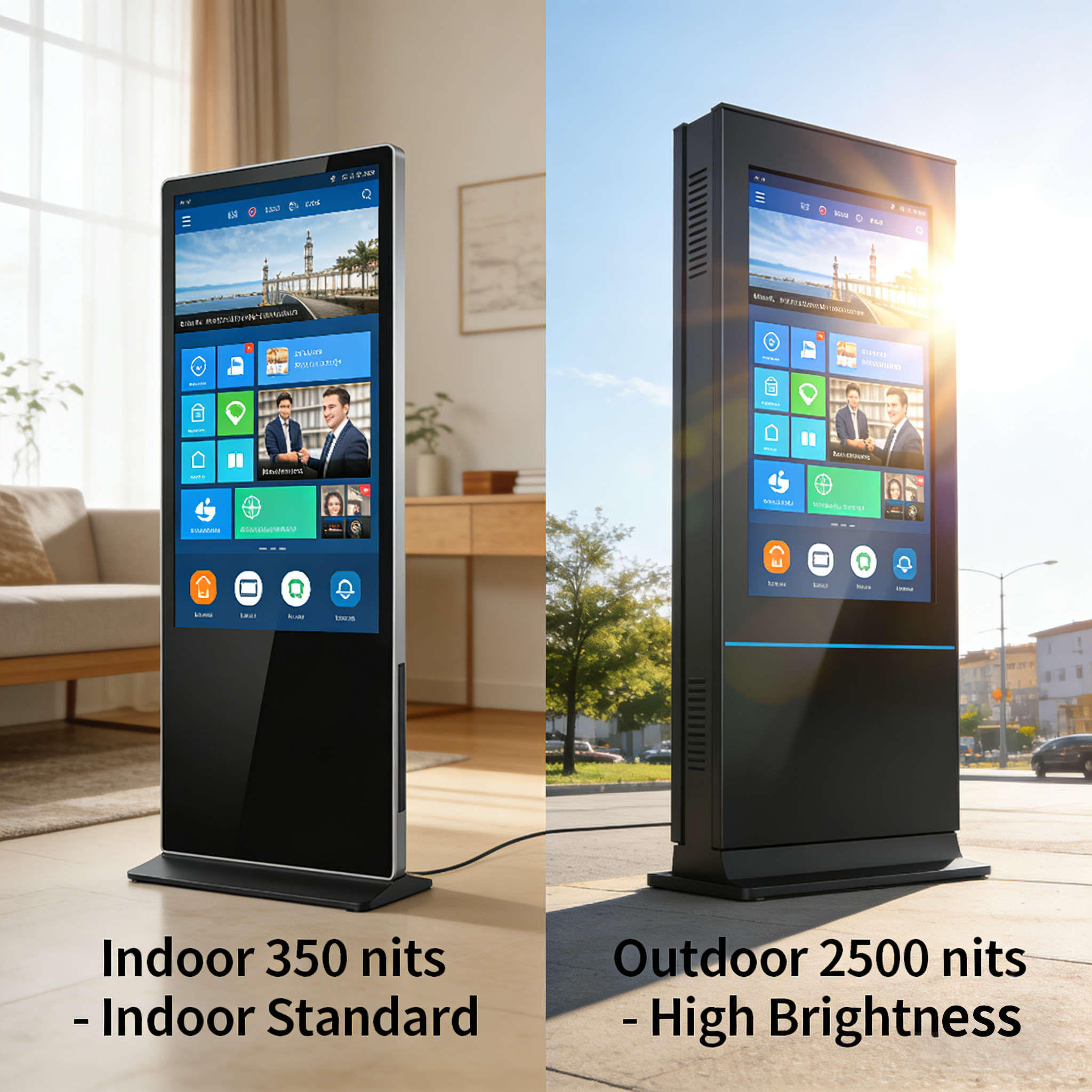
The answer depends entirely on your installation environment. Here's a quick breakdown
350 nits – Indoor Standard
Ideal for:
Shopping malls / retail stores
Corporate lobbies
Hotels & restaurants
Art galleries (especially our ArtFrame series)
Conference rooms
Delivers vibrant colors without eye fatigue
Perfect for controlled lighting environments
Cost-effective for high-volume indoor deployments
2500 nits – High Brightness (Semi-Outdoor / Window-Facing)
Essential for:
Storefront windows (direct sunlight)
Outdoor digital signage
Drive-thru menus
Gas station displays
Any location with significant ambient light
Sunlight readable – no washed-out images
Maintains contrast even in direct sun
Built for 24/7 continuous operation
Pro Tip:
If your screen is placed behind a glass window facing the sun, 350 nits won’t cut it—you'll need high brightness (1500–2500 nits) to keep content visible. For indoor spaces with controlled lighting, 350 nits provides the best balance of visual comfort and energy efficiency.
At [Your Brand], we offer both options:
ArtFrame Series (350 nits) – Museum-grade display with real wood frame, perfect for high-end interiors
Outdoor / High-Brightness Series (2500 nits) – Sunlight readable, rugged design for demanding environments
Need help choosing the right display for your next project?
Drop a comment or DM me—I’m happy to share a recommendation based on your installation setting.
What’s your typical installation environment? Indoor, storefront, or full outdoor? Let me know below!